How to create a new Aggregate Grid report
Version: DashboardFox v12
Role: Composer or higher
Permission: Composer access to the application
Overview
Aggregate Grid Report offers more power and includes more total and subtotal features incorporated when configuring it than using the options menu in the report fields.
In this guide, we will talk about how to configure the report, the different uses of its aggregate function and how each configuration affects the report output.
Also, as of now, drill-down capabilities does not exist within the aggregate grid type of report.
Accessing the Composer Section
This section shows the step on how you can access the composer section
1. Once logged in, click Composer option found at the left side bar.
Creating Aggregate Grid Report
This section shows the steps on how you can create your aggregate grid report
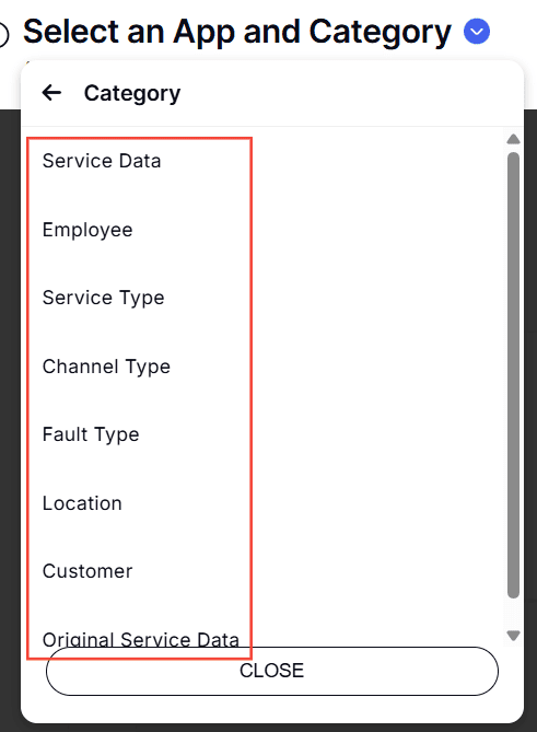
Select Application and Report Type
1. Click the down arrow next to Select an App and Report Type to open the dropdown menu.
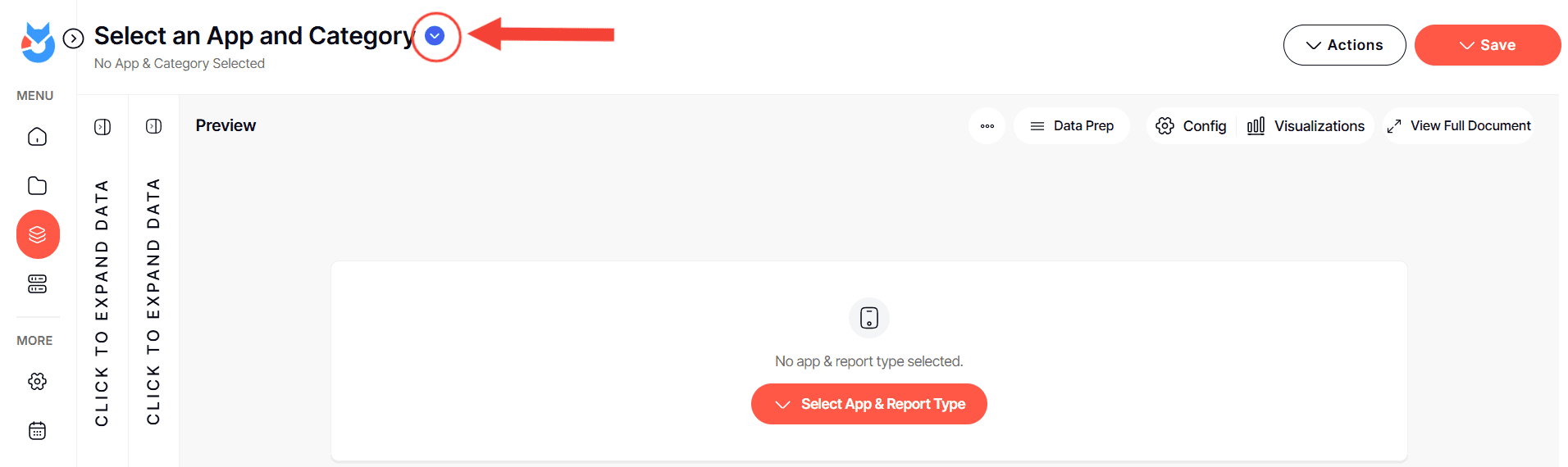
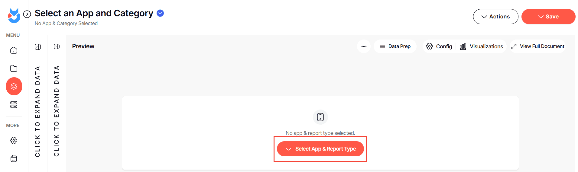
Or, Click the Select an App and Report Type button found in the middle of the interface
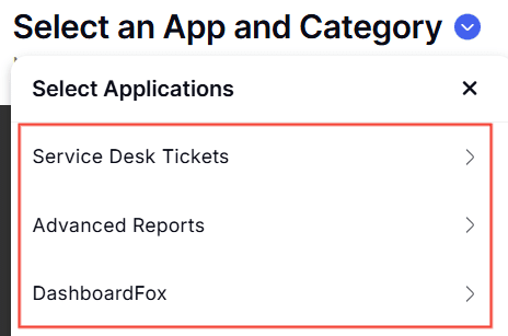
2. Choose the application you wish to build a report for. The options are the applications you are authorized to modify.
3. Now, pick the type of report you intend to create. Depending on the application, different report types will be available for your selection.
Composing Your Report
This section shows the steps on how you can build from the report you created
1. With a report type selected, a report tree will appear. This contains all possible fields for your report.
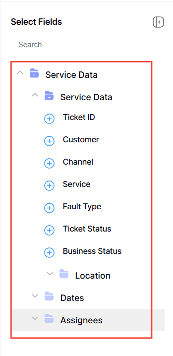
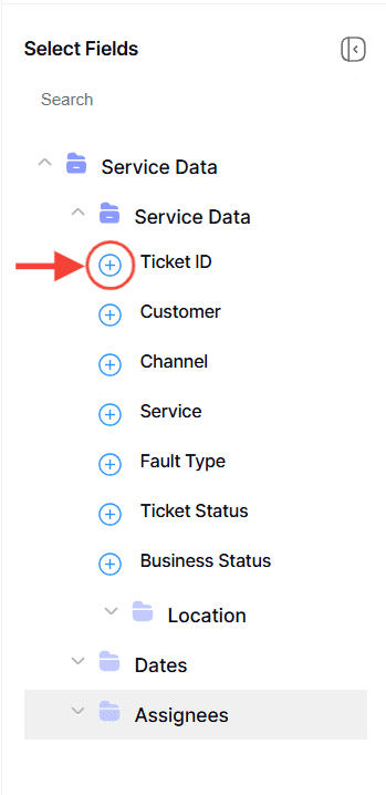
2. Click the plus icon (+) next to the fields you want to add. These will become the columns in your report and will be reflected in the preview area.
For more in depth process, here is an article on how to create a new data grid report from scratch.
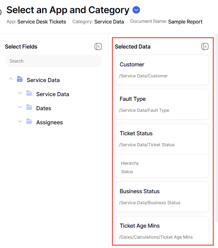
3. Once you have your selected fields, they will appear in the report fields section.
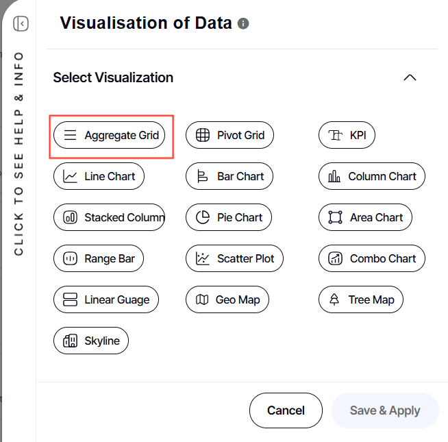
4. Under Preview Section, click Visualization
![]()
Select Aggregate Grid
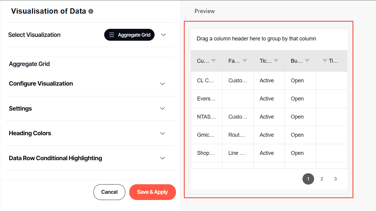
5. You’ll be taken to the configuration of the report.
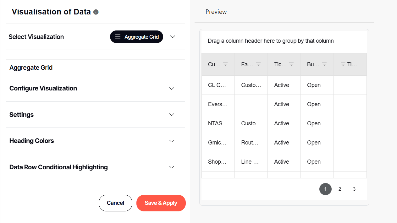
6. At the left side is the preview of the report, where each changes the user makes will reflect real-time.
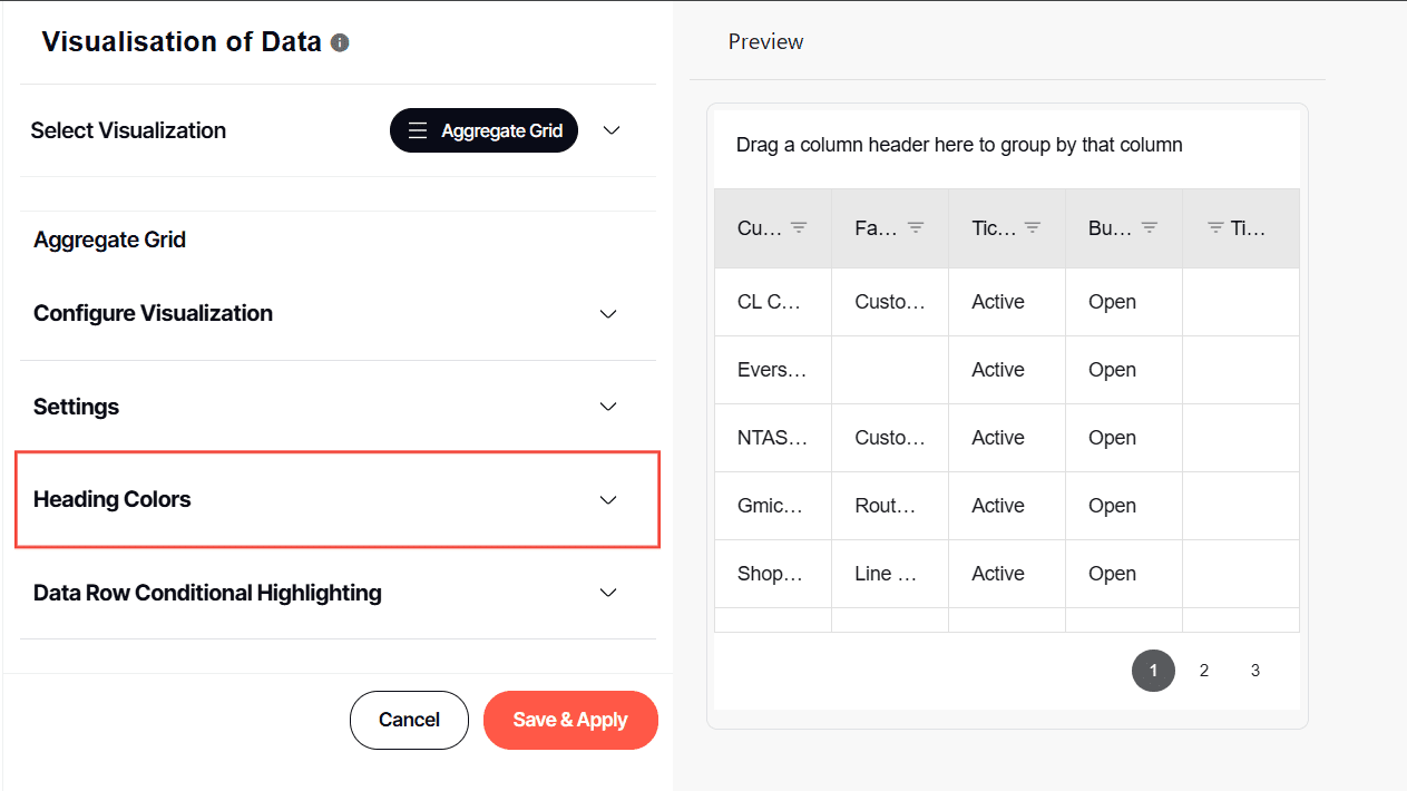
Configure Visualization
This section explains how the user can configure the selected report field within the aggregate grid report they are building.
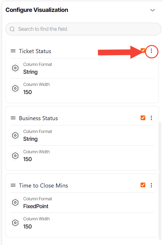
1. Under Configure Visualization, you can see the selected report field for the report you are building.
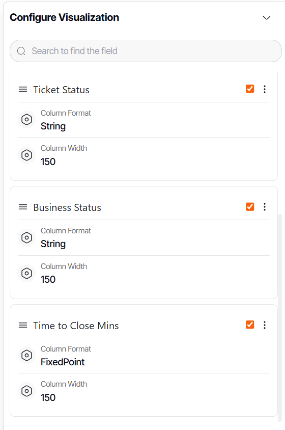
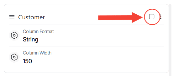
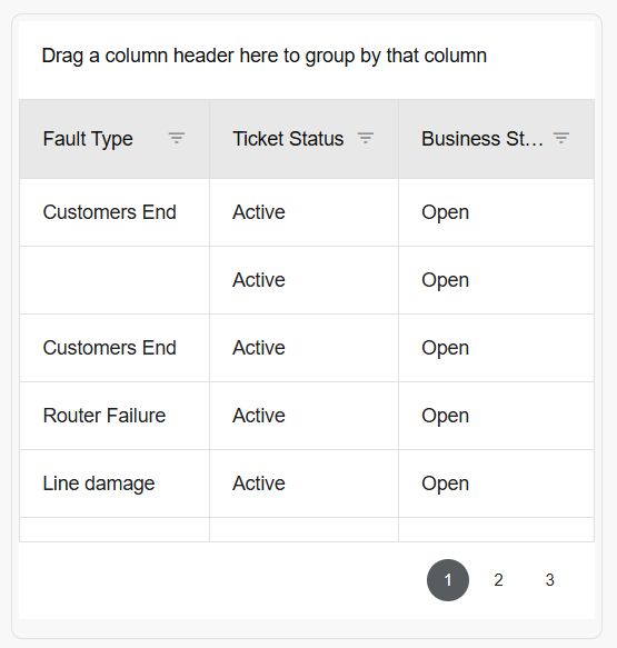
2. When the checkboxes found on each report field are ticked off, this means that they are included in the report.
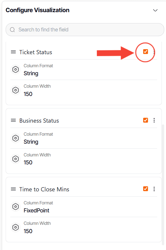
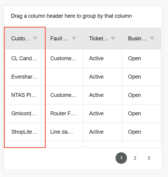
3. If user wants that specific field not to be included, simply click on the check box.
4. To configure each report field, click on the three dots button.
Here are each actions mean:

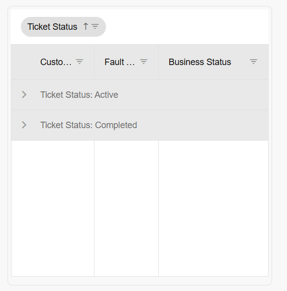
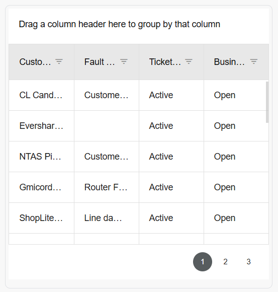
Grouped By: This is useful when you want to group the data by geography, date, or status / stage of a data such as won, lost, or in progress.
1. Click on Grouped By, select Grouped to activate it and
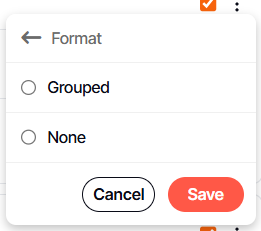
2. Click Save

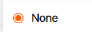
3. Click None to deactivate
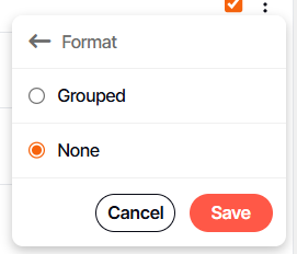
4. Click Save
Grand Totals has the following functions.

- Count: Counts the instances of how many the data appear in the report. Example would be a sales pipeline where its report field is a deal stage with values in progress, won, and lost under it. This function will count how many in progress, won, and lost you have.
- Sum: Adds all the value of the selected report field. Example would be the select field value is currency. This function will total all the currency you have.
- Max: This function displays the maximum value of the selected field. Example would be the select field value is currency, it will display the highest currency under that field.
- Min: This function displays the minimum value of the selected field. Example would be the select field value is currency, it will display the lowest currency under that field.
- Avg: This function displays the average value of the selected field. Example would be the select field value is currency, it will display the average under that field.
1. Simply click on the desired function to activate it.

2. Click Save
3. Click None to deactivate it.
4. Click Save
Column Format: By default, DashboardFox will display the format based on the value of the report field.
1. To change, simply select a format you want that field to have.

2. Click Save
Note: If the value under name is a text, select string value in format. If its value is money, select currency.
Column Width: This enables the user to adjust the column width of the report field.
1. Simply input a number

2. Click Save
Heading Colors : Applicable only when data are grouped by.
1. Click on Heading Colors Section
2. Select Ground Top Level Color
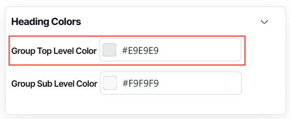
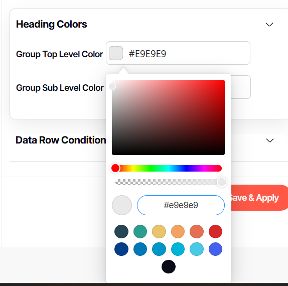
3. Select Group Sub Level Color
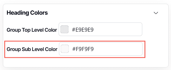
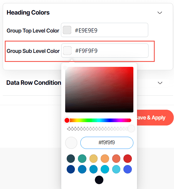
4. Click Save & Apply

And there you have it! You now know how to create an aggregate grid report from scratch!